- Client:
- Versus Media
- Services:
- Brand Identity,
- Print & Digital
(incl. Website)
Context & ChallengeSubversus is a creative studio dedicated to creating positive cultural subversions. Founded by Directors Tanya Babic and Jason Sukadana as a sister company to Versus Media, it is an answer to a new direction in content, allowing them to self-initiate and lead ideas, instead of being client-directed. Their work presents new voices and perspectives – unearthing stories that are sometimes serious, sometimes irreverent, but always smart and beautiful – for clients such as the Sydney Opera House, Carriageworks and Phoenix Central Park.
The challenge was to position them as a leader amongst a new breed of highly innovative entertainment studios.

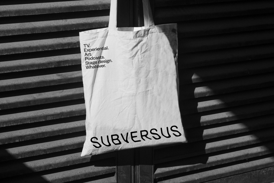
Dynamic & SubversiveWith such a strong and conceptual brand name, we wanted to create a memorable brand with a focus on the logo. The dynamic word mark adds to the meaning of fluid ideas, undercurrents, and stories that lie beneath the surface. With the most prominent placement, the logo is in constant dialogue with the brand’s cinematic content.
A Minimal StageThe remainder of the identity is bold and minimal. We wanted to let the content shine and describe a brand that cares deeply about the unique qualities and stories of each production. The simplicity communicates a maturity and confidence that rightfully places Subversus at the top of their game.
Dynamic & SubversiveWith such a strong and conceptual brand name, we wanted to create a memorable brand with a focus on the logo. The dynamic word mark adds to the meaning of fluid ideas, undercurrents, and stories that lie beneath the surface. With the most prominent placement, the logo is in constant dialogue with the brand’s cinematic content.


A Minimal StageThe remainder of the identity is bold and minimal. We wanted to let the content shine and describe a brand that cares deeply about the unique qualities and stories of each production. The simplicity communicates a maturity and confidence that rightfully places Subversus at the top of their game.


Collaborator
Web Build — The Designers Developer
Awards
Graphis Awards 2023 — SilverAGDA Awards 2023 — Finalist
WE’D LOVE TO HEAR FROM YOU! PLEASE


