

- Client:
- QT Hotels & Resorts
- Services:
- Brand Identity
- Art Creation
- Print Application
- Environmental
Context & ChallengeThe Gold Coast is one of Australia’s most iconic beachside destinations, with a laid-back surf culture, as well as buzzing bars and venues. QT Gold Coast redesigned its hotel to reclaim its leading position on both fronts – with a resort-style pool area, spa, 4 F&B outlets, exciting party vibes and a high-end relaxed flair. In line with the offering and the overarching QT brand ethos, the hotel needed an unusual yet sophisticated new brand identity. It had to stand out in a saturated market of hotels and clubs boldly and elegantly, where the ‘vintage sunny beach’ concept had been replicated numerous times.

Context & ChallengeThe Gold Coast is one of Australia’s most iconic beachside destinations, with a laid-back surf culture, as well as buzzing bars and venues. QT Gold Coast redesigned its hotel to reclaim its leading position on both fronts – with a resort-style pool area, spa, 4 F&B outlets, exciting party vibes and a high-end relaxed flair. In line with the offering and the overarching QT brand ethos, the hotel needed an unusual yet sophisticated new brand identity. It had to stand out in a saturated market of hotels and clubs boldly and elegantly, where the ‘vintage sunny beach’ concept had been replicated numerous times.
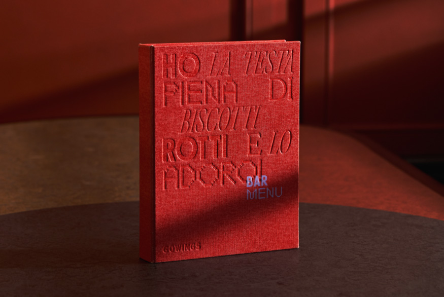
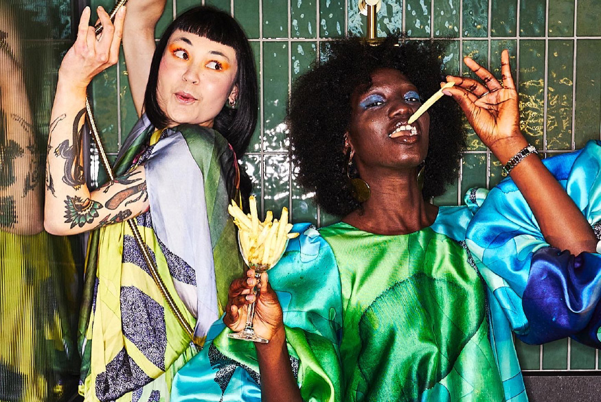
Good Time / Down TimeThe brand required a clear concept that could be amplified; a space that they could own in the market. The brand idea ‘Good time / down time’ plays on the high and low energy of this new resort-style playground, inviting the guest on a weekend escape and weekend extravaganza, to the party and the chill. It propels both visual and verbal communication.
Gold Coast Meets MiamiThe visual identity reflects the concept of ‘good time / down time’. Vintage beach-inspired patterns and contrasting vivid 3D typography are layered up to capture QT’s unique energy and offering, where Gold Coast beach meets Miami beats.
A Colourful ExperienceIn support of the QT ethos, the colour palette dares to stand out. It balances vintage tropical coastal tones with vibrant fluorescent spot colours, that give a nod to both sides of this uniquely colourful experience. The colourful splashes turn the touchpoints into quirky moments, adding to the playful QT experience.
Good Time / Down TimeThe brand required a clear concept that could be amplified; a space that they could own in the market. The brand idea ‘Good time / down time’ plays on the high and low energy of this new resort-style playground, inviting the guest on a weekend escape and weekend extravaganza, to the party and the chill. It propels both visual and verbal communication.


Gold Coast Meets MiamiThe visual identity reflects the concept of ‘good time / down time’. Vintage beach-inspired patterns and contrasting vivid 3D typography are layered up to capture QT’s unique energy and offering, where Gold Coast beach meets Miami beats.


A Colourful ExperienceIn support of the QT ethos, the colour palette dares to stand out. It balances vintage tropical coastal tones with vibrant fluorescent spot colours, that give a nod to both sides of this uniquely colourful experience. The colourful splashes turn the touchpoints into quirky moments, adding to the playful QT experience.


Collaborators
3D — Chris Thompson Interior Design — Nic Graham & Assoc. Location photography — QT Hotels and ResortsPrint Production — Lisa McCulloch, Event
Award
Graphis Awards 2023 — Silver
RELATED PROJECTS OR SEE ALL


WE’D LOVE TO HEAR FROM YOU! PLEASE