

- Client:
- QT Hotels & Resorts
- Services:
- Brand Identity
- Art Creation
- Print Application
- Signage
Context & Challenge‘Rooftop at QT’ is the bar sub-brand of QT Hotels & Resorts, a family of luxury hotels across Australia and New Zealand. With a growing portfolio, QT Hotels required a rooftop bar sub-brand. The main challenge was the creation of just one brand – to inspire a sense of customer loyalty across multiple locations – with the flexibility to make each location distinctly unique – reflecting the individual spaces, experiences and hotel brands of each destination.

Context & Challenge‘Rooftop at QT’ is the bar sub-brand of QT Hotels & Resorts, a family of luxury hotels across Australia and New Zealand. With a growing portfolio, QT Hotels required a rooftop bar sub-brand. The main challenge was the creation of just one brand – to inspire a sense of customer loyalty across multiple locations – with the flexibility to make each location distinctly unique – reflecting the individual spaces, experiences and hotel brands of each destination.
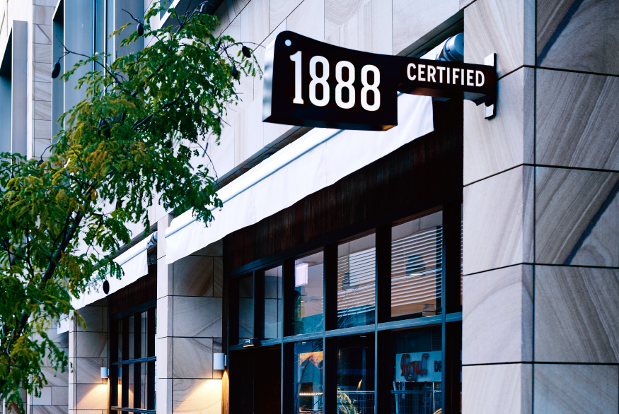
A Dynamic LogoThe new master logo celebrates and brings focus to the rooftop location that all bars have in common. The adaptive system shifts the logo to the ‘roof’ of each application, regardless of format. It adds a distinct feature to each application.
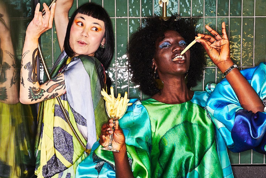
Treated With IntrigueA lenticular lens distortion is used as a continuous brand treatment. It brings a sense of mystery and intrigue to all identities, as well as an abstraction and artfulness that resonates with the overarching QT brand. The individualised imagery covers a large spectrum to speak to each location, whilst being visually tied together by the treatment.
Design SystemWe developed a coherent brand system for use across all locations, with imagery being led by the individual bar concepts. The system consists of a master logo, typography and image treatment which make for a strongly recognisable sub-brand and an efficient rollout. The interchangeable imagery infuses a rich location-specific narrative to each bar.


A Dynamic LogoThe new master logo celebrates and brings focus to the rooftop location that all bars have in common. The adaptive system shifts the logo to the ‘roof’ of each application, regardless of format. It adds a distinct feature to each application.


Treated With IntrigueA lenticular lens distortion is used as a continuous brand treatment. It brings a sense of mystery and intrigue to all identities, as well as an abstraction and artfulness that resonates with the overarching QT brand. The individualised imagery covers a large spectrum to speak to each location, whilst being visually tied together by the treatment.


Design SystemWe developed a coherent brand system for use across all locations, with imagery being led by the individual bar concepts. The system consists of a master logo, typography and image treatment which make for a strongly recognisable sub-brand and an efficient rollout. The interchangeable imagery infuses a rich location-specific narrative to each bar.


Collaborators
3D — Chris ThompsonInterior Design — Nic Graham & Assoc. Location Photography — QT Hotels and ResortsPrint Production — Lisa McCulloch, Event
Awards
AGDA Awards 2021 — DistinctionGraphis Awards 2021 — GoldEat Drink Design Awards 2021 — FinalistBest Award 2021 — Finalist
RELATED PROJECTS OR SEE ALL

WE’D LOVE TO HEAR FROM YOU! PLEASE