

- Client:
- QT Hotels & Resorts
- Services:
- Brand Identity
- Art Creation
- Print Application
- Environmental
Context & ChallengeWith their latest edition opening in Newcastle Australia, QT was looking for a hotel brand identity that champions their ethos and exciting new location, in an unexpected and non-cliché way. It was a case of rebranding the destination Newcastle, through the lens of QT.
Inspired by Newcastle’s proximity to the coast and moonlight reflections, the interior architect Nic Graham & Assoc. had initiated a lunar-inspired narrative for the space. As destination identity and experience must go hand in hand, we wanted to focus on an emotive brand idea that extended beyond the depiction of a moon.
A Story of TransformationWith each lunar cycle comes the opportunity of a new beginning and with it the chance to transform into something unique. ‘New Beginning’ emerged as the brand essence resonating with both guests and the locale of Newcastle. Having undergone a remarkable transformation, the moon’s reflection on the city’s shoreline subtly acknowledges this evolution. Beyond the moon’s symbolism, this concept makes for a rich creative territory.
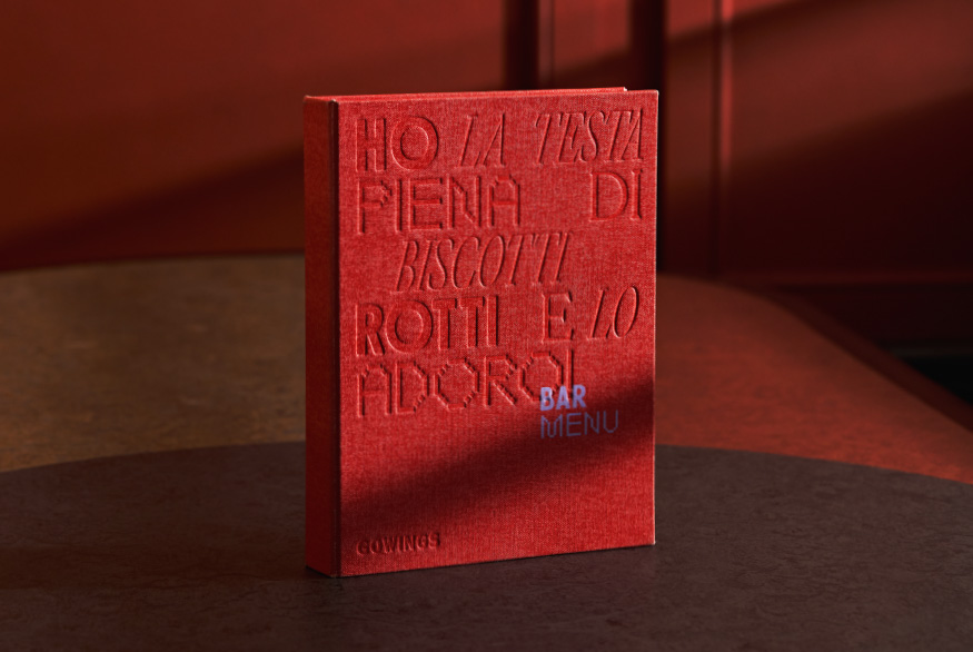
Crafted TouchpointsThe abstracted art of moon reflections is paired with refracted typography. An intriguing shimmer runs through all printed communications – achieved through a complex layering of silver inks and holographic foil. The touchpoints engage on multiple levels: from the shiny tactile finish down to the profound message, inviting a uniquely subjective response.
Spatial BrandingWe are extremely passionate about spatial branding – about turning brands into experiences. After all, valuable experiences build emotional connections, so it is an amplified platform. Work alongside Nic Graham & Assoc we build a connection between the lunar-inspired interior and the hotel brand, with a range of large-scale works that reinterpret the themes of the moon, new beginnings, and transformation.


A Story of TransformationWith each lunar cycle comes the opportunity of a new beginning and with it the chance to transform into something unique. ‘New Beginning’ emerged as the brand essence resonating with both guests and the locale of Newcastle. Having undergone a remarkable transformation, the moon’s reflection on the city’s shoreline subtly acknowledges this evolution. Beyond the moon’s symbolism, this concept makes for a rich creative territory.


Crafted TouchpointsThe abstracted art of moon reflections is paired with refracted typography. An intriguing shimmer runs through all printed communications – achieved through a complex layering of silver inks and holographic foil. The touchpoints engage on multiple levels: from the shiny tactile finish down to the profound message, inviting a uniquely subjective response.


Spatial BrandingWe are extremely passionate about spatial branding – about turning brands into experiences. After all, valuable experiences build emotional connections, so it is an amplified platform. Work alongside Nic Graham & Assoc we build a connection between the lunar-inspired interior and the hotel brand, with a range of large-scale works that reinterpret the themes of the moon, new beginnings, and transformation.


“The QT Newcastle hotel visual identity project was a difficult brief. We wanted to move away from using typical ‘subject matter’ in the design, and the hotel design narrative provided limited inspiration. What Toben produced, based on such a tricky brief, is nothing short of incredible. We believe it’s our best ever hotel visual identity within the group. Once again Toben have raised the bar for our hotels visual design.”
Danelle Ayers. Head of Brand & Marketing, QT Hotels & Resorts
Collaborators
Copy — Language DesignInterior Design — Nic Graham & Assoc.Location Photography — QT Hotels and ResortsPrint Production — Lisa McCulloch, Event
Awards
Graphis Awards 2023 — SilverBest Award 2023 — FinalistAGDA Awards 2022 — Finalist
RELATED PROJECTS OR SEE ALL


WE’D LOVE TO HEAR FROM YOU! PLEASE